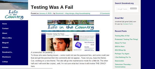
So, we have a new theme! YAY! Welcome to Adaption, which changes depending on the way you are viewing the blog. If you do not see two sidebars – one on the left, one on the right, like the image above, then you are getting a smaller version of the theme.
We have a new title image too – unfortunately this theme does not allow for a large header image like we have been used to here at Life In The Country.
There are a few little changes still to be made, eg the comments area I want to make some changes and we’ve removed a lot of extra padding but will have to add some back in for the text of the posts I think, as my line breaks seem to have gone AWOL. But for the most part this is how it will stay and I’m deeply thrilled we achieved it in a few hours.
PS I love how meta this screenshot is, showing a screenshot of the old design and then the new design surrounding it. :)


Tweaking a new theme is a great deal of fun – and headache. It’s looking pretty good to me!
I did not think I would love any theme as much as my last one, but I do love this. :)
Especially the font, and the titles. I love the line under the heading and then the stuff under that, the date, the by, the tags.
Just a few padding tweaks and I think this will be livable for a long time. :)