Do you blog for you, or for your readers?
This is a serious question that every blogger needs to consider carefully. If you blog for yourself, you will choose a blog design that appeals to you, not caring what your readers think. If you blog for your readers, you probably will think about what your readers would like to see when they visit your blog.
If you blog for your readers and you chose your design for you? You might be upsetting potential new readers without even thinking about it.
Some Food For Thought
Light Is The Norm
If I could design my blog to look how *I* want it to look, the background would be dark instead of light because I find dark backgrounds easier on my eyes. I design this site for the readers, which means light is the best choice. Not everyone has an LCD screen yet. Dark backgrounds on a CRT screen (the older style of monitor which is more like a TV) are difficult to view.
Dark text on a light background is what the majority of Internet users are used to. It is what they see on most websites they visit. They are so used to it that when you make a site with a dark background color, they react negatively without knowing why. If you want to appeal to the broadest range of people, you have to take things like this into consideration.
Everyone Sees It Differently
On a forum I used to visit – it is no longer in existance sadly – they had a very dark blue color scheme.. People reading the forum on the older CRT screens often had to highlight the text with their mouse in order to be able to read it.
Users had been doing this regularly for some time BUT NOBODY TOLD THE SITE OWNER they were having so much trouble with the color scheme until the owner was considering making a change to the site themselves. I cannot imagine how annoying it must have been for those people to read the forums.
The Psychology Of Color
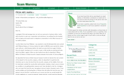
When designing a site it is important to consider the psychology of color. When I was a part of the team putting together a scam warning website – which also no longer exists – we looked into what would be the best color for a website designed to support scam victims.
The three colors we considered using on the site were blue, lilac and green. These are calming colors. You’ll note these are colors I tend to use a lot here, too.
For more info on color psychology, check out Color_Expert.
Color Is Important
When you’re putting colors together on your site you need to stop and think – do they work together? Do they look good together? They may look ok on your screen but be sure to check how they look on other kinds of computer monitors too.
Take A Moment
If you visit a blog and something about the design truly puts you off, you may want to consider taking a moment to let the blogger know. Politely, of course. If you are a blogger, you may also want to ask your readers.. but..
Will People Tell You The Truth?
Ah, there’s the difficult part. If you have been blogging for a while, you have a little community of people who love your content. If you made your background red with pink text (take a look, I made it especially for ya’all), they’d possibly still read it anyway, or they might seek out an alternate way to read – perhaps via a feed reader or subscribing by email.
Did you like the clashing red and purple title? How far could you read before you thought hell no, I gotta go! If you ask your readers what they think of your site design, they will tell you what they THINK you want to hear. They will be loyal. They will be polite. They will be friendly. They are the equivalent of men telling their wives “No honey, I don’t think it makes you look fat”.
That’s all well and good – and wise on the part of the man and on the part of the bloggers who read you – by now you are probably reading them back and they do not want to risk your readership by being brutally honest.
Unfortunately it does not help you as a blogger who wants to improve your blog design. It does not help you capture new readers. It does not help you to know what they find annoying. Even if you ask them to be brutally honest, some readers will struggle to do so. Not me. ;) Just so you know. ;)
Brace Yourselves Now
I am about to tell you a harsh truth. New readers coming to your blog for the first time? They will hit the close button in that top corner without reading ONE word of your content if they are put off by the color scheme or your header graphic.
If your blog makes their eyes hurt. If it looks like fingernails on a blackboard for the eyes. If your header graphic is poor quality. If your font is unattractive. There’s a multitude of design mistakes you can make as a blogger which will send potential new readers away quicker than you can blink.
Whether You Like It Or Not
There are many blogs out there – and the majority of blog readers will take a blog with good design but lesser content over a blog with bad design and good content EVERY time.
You work hard on your content so you owe it to yourself as a blogger to present it to potential new readers in a way they can see it. Especially given how difficult it is to get people to visit your blog in the first place.
Ask Someone Impartial.
If you want a fresh set of eyes to take a look at your blog the way a new reader would look at it, use my contact form and ask me. I will tell you the truth. I won’t be nasty about it. I’ll just be honest. It might be hard to hear but you may need to hear it. I also will give you ideas for improvement, which is useful.
Resolution Matters
If you are viewing my blog with your screen resolution set to 800×600, you have a vertical scroll bar at the bottom of your screen. My template width is 1000. That means there’s 200 extra pixels you have to scroll to see. In fact that is my entire right sidebar. Not a good look, right?
When I designed the template, I knew about this. I looked at my site stats and saw the majority of my readers (90%) were viewing the site in 1024×768 – which is becoming the new standard these days. It used to be 800×600 but as people change to LCD screens and larger screens they can’t use 800×600*. Unless they are my parents, in which case they will use 800×600 for everything because it makes the text bigger – they are too lazy to wear their glasses!
Make A Decision
So the first thing you need to do when considering a blog re-design is make a decision about resolution – and you need to take into account what your readers screen resolution is in order to do it. This means looking at your counter – bearing in mind counters are unreliable. 800×600 is one way you can go, 1024×768 gives you a lot more space.
If less than 85% of your readers use 800×600, you could go with 1024×768 but know that you run the risk of annoying people who use 800×600. On my site, they’ll miss out on seeing the right sidebar but they get the full main text and the left sidebar. That’s an OK compromise.
I found these excellent articles which are worth a read before you make the decision – How Tall and Wide Should I Design My Website? and also Understanding Monitor Resolution
Don’t Change
There is a blog I removed from both my reader and my links. The reason I removed it is simple. Each time I went to the blog, they were using a new template. They had changed it many, many times over the last couple of months. I feel like they are never going to make up their mind and stick with one template and frankly, I was tired of watching the indecision in progress!
If you want to try out a new template don’t do it on your actual blog that readers visit. Test it out on a test blog first. Blogger makes this easy for you – you can have as many blogs as you want. So does wordpress.com though that is tougher as they make you pay to customise templates. When you are sure you’re happy with it, install it on your actual blog – and stick with that template for at least 2-6 months.
Change is Hard
People do not like change. We bloggers are constantly tweaking, moving things around, adding things, removing things, making new blocks in our sidebars. I am as guilty of this as the next blogger. I am not saying never change anything, I am saying keep in mind the impact it has on your readers.
Your readers may know where to find something right now. If you move it and they are looking for it, they will be frustrated unless they can easily see where you moved it to. If you feel the need for change (as I recently did with my sidebars) pick one day, post a note to your readers who may turn up mid-changes to “bear with me, I’m changing some things around”, mess with it till you have it as you like it, then let your regular readers know what you have changed or removed via a blog post.
Above The Fold.
The instant first impression a user has of your website is what loads onto their page that they can see without scrolling. This is called “above the fold” – you know those broadsheet newspapers which have a fold on the front page, about halfway down? They know what is above the fold is what people see – and why they buy the newspaper.
It is no different on your blog. Decide what you want people to know about you when they first look at your page, and put that above the fold.
Browser Matters
Most people only use one internet browser. It might be Internet Explorer. It might be Mozilla Firefox. These are the two main ones you will see on your site stats. Do you know how your site looks in the one you don’t use? Do you know how it looks in different versions of the one you don’t use? A lot of people don’t use the latest version of browsers – when they find a stable one they stick with it like super glue.
Do you know how it looks in the rarer browsers like Opera, etc? Make a blog post where you ask people using those browsers to take a screen shot for you. Your readers using those browsers will generally be happy to help out.
IE NetRenderer allows you to check how a website is “rendered” (how it looks) when using Internet Explorer – several versions of it. I am still looking for a version of this for Firefox. Anyone know where to find it?
Flashing is bad
People associate flashing things with advertisements, which are becoming more prevalent on all the websites we visit these days. For Firefox users, you can get an extension called Ad Block Plus – and let your inner self be at peace without ads interrupting your internet. For your personal blog, I do not recommend anything be flashing. It’s annoying to many people.
Template Blend
Blogger has a standard set of templates which people can use. It is easy to just pick one of those and leave it at that. You would be making a major mistake as a blogger if you did, though. Anyone else using that same template can be mistaken for you. It is sort of like walking into a room where everyone is wearing the same outfit. How do you find the people you know, among the apparent clones?
The least you should do is change some of the colors and the font – Sephy’s post will explain how to do that. You can check it out here – Demystifying Blogger Template Editing.
Good Templates Are Out There
You just have to know where to look. Try searching the name of your blog platform combined with free templates and see what you get.
Not Everyone Agrees.
Good design is not easy. There is no one size fits all. If there were, nobody would want it because all our blogs would look the same. As a blogger, what you need to do is make sure you are not turning off new readers by making bad design decisions. Unless you’re writing your blog just for your friends and family, who will love you regardless.
New readers won’t have a chance to love you. They’ll be leaving skid marks with their mouse in order to close your site as quickly as they can, and move on to another blog – where the content may not be half as good BUT they aren’t offended by the design, or the flashing ads, or the music that starts playing without them asking for it, or the myriad of other things you can get wrong as a blogger.
Further Reading –
15 Design Decisions That Annoy Readers – Some seriously annoying things that bloggers do are listed here – do YOU do any of them? ;) I do – I need to look into that Google Ajax search box, adding it to my todo list for tomorrow.
45 Excellent Blog Designs – Inspirational stuff!
Blog Design at ProBlogger – This is the category for Blog Design which contains quite a few useful food for thought posts.
Top 10 Weblog Design Mistakes – I disagree with number 2 – sometimes I think putting a photo of yourself on your blog is a terrible idea and some of the ones I have seen scare me greatly. Number 5 I think a lot of bloggers miss out on. Your top 5-10 posts should be shown above the fold – give readers the chance to access your best posts as soon as they land on your blog. You’ll note I have moved mine to be above the fold now.
Useful Things –
VisiBone Webmaster’s Color Lab – You can test colors against each other here.
Non-Dithering Colors – Gives an explanation of why the 216 color palette is better for use generally, and also all the color codes you may need.
HTML Goodies – Lots of HTML goodness to help any blogger.
Over to you
What are your thoughts on blog designs? Do you like yours? If not, do you want to change it? Do you need help to change it? Sephy is writing a companion post to this one which can help you with a few things.
If you liked this blog post, feel free to Stumble it. :)
*Unless they are my parents, in which case they will use 800×600 for everything because it makes the text bigger – they are too lazy to wear their glasses! This drives both me and the other half absolutely up the wall. They have a wide screen laptop. I’ll take a photo of what a webpage looks on it for ya’all sometime, but in the meantime it looks bad. Trust me. ;) It’s truly fingernails on a blackboard for your eyes.
**Cybercelt left me a great comment about that a while back, letting me know that you can go into your Blogger profile (on your profile page when you are signed in, click edit my profile, then Show my blogs, then Select blogs to display) and choose which blogs are displayed in your profile. If you have more than one, I suggest you choose one to be the main blog, and link to your other blogs from that blog page rather than have them all listed in your profile to make it easier for people to find you, but it’s your profile. ;)
